PROJECT BRIEF
A two weeks design sprint to design a web application that tracks and manage expense report and helps track company expenses and profits.
MY ROLE
Market and User Research, UX/UI Design, Visual Design, and Usability Testing. This was an individual case study.
USER STORY
As a user, I want to track my expenses so that I can better understand their usage and effect and communicate those factors to my Company.
MARKET RESEARCH: WHAT IS PAIN TODAY?
Extensive market research was done to understand how users go through expense tracking pain in the US today. So many employers and employees suffer from expense report tracking. Thus, many employers are now pushing to use mobile/web applications in the market to track their employee's expense reports.
USER RESEARCH: HOW DO PEOPLE UNDERSTAND PAIN?
My research involved interviews with 5 employees, phone interviews with people with pain in keeping track of their expenses, and a survey with 6 participants.
Those interviews and surveys revealed that there are qualitative and quantitative measures of pain when expenses are in large amounts. Thus, expenses and profits both have a key relationship in tracking users' as well as employers' budgets.
1. Tracking is a helpful assessment of improvement since it is measurable and objective.
2. Keeping a track record of users' expenses and profit is healthy for both employees and employers both.
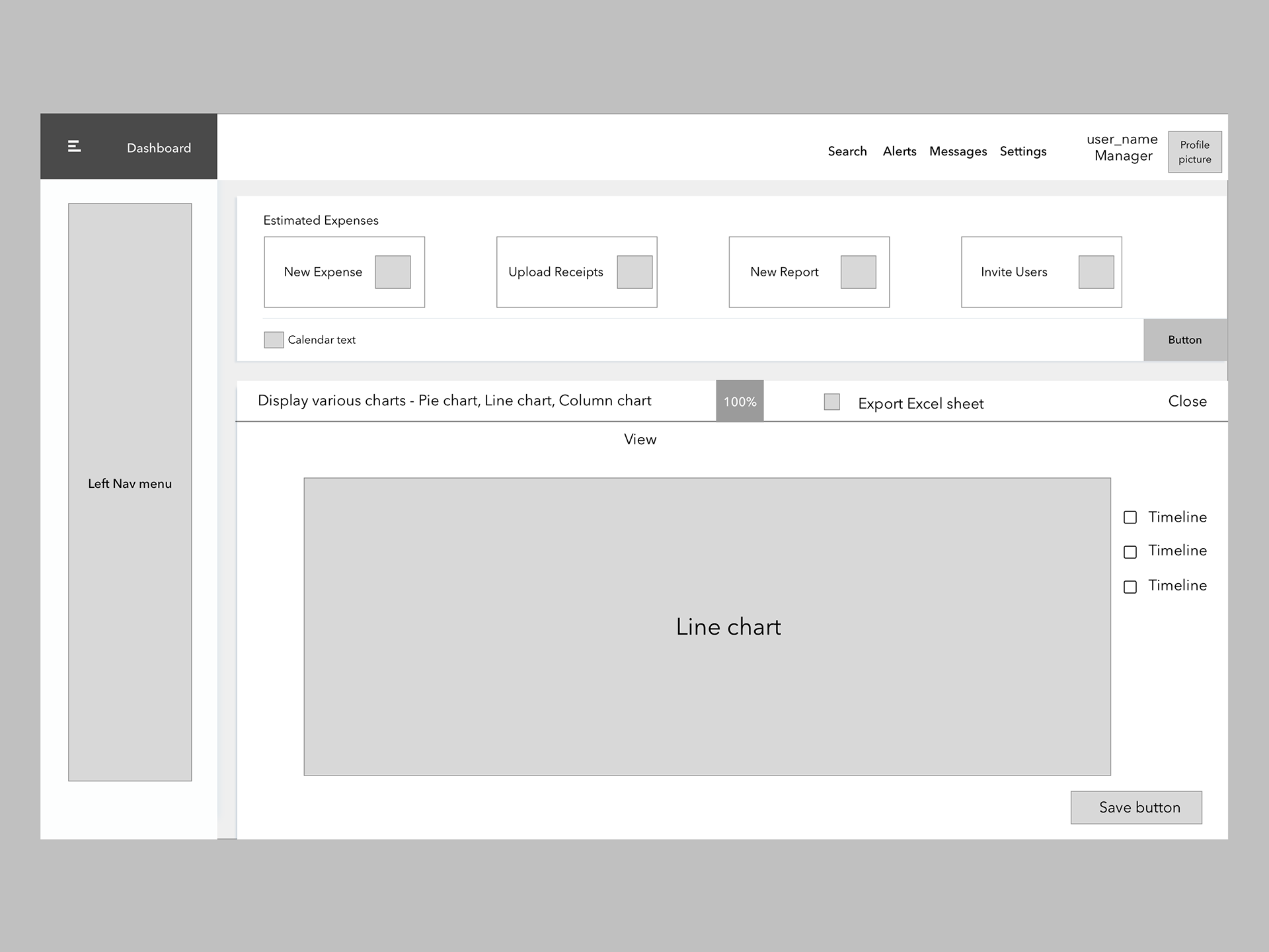
LOW-FIDELITY WIREFRAME
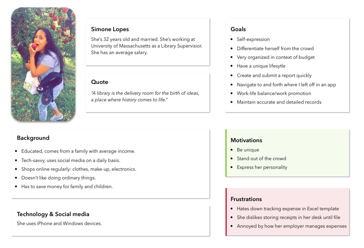
PERSONA's
From my user interviews, it was clear that all users’ main goal is to submit their expense reports as quickly as possible. I also discovered that, although many applications are available to all employees, junior engineers travel the most for both training and doing inspection purposes and various other activities. I created the persona of Simone Lopes, the primary user of this application. Because Simone is working at the University of Massachusetts with unreliable internet and frequent interruption to her workflow, her secondary goal is to easily navigate back to where he left off in a report.
SKETCHING, ITERATING, AND USER TESTING
I went through several iterations of sketching and ideation. The main goals to achieve were:
Allow users to track expenses and profits in both quantitative and qualitative measures.
- Present an intuitive UI.
- Display data clearly.
- User testing revealed a few key findings:
- Many people preferred an interactive scrolling function over buttons.
- Many people immediately associate pain with displaying expenses, so those factors should have higher priority on the tracking UI.
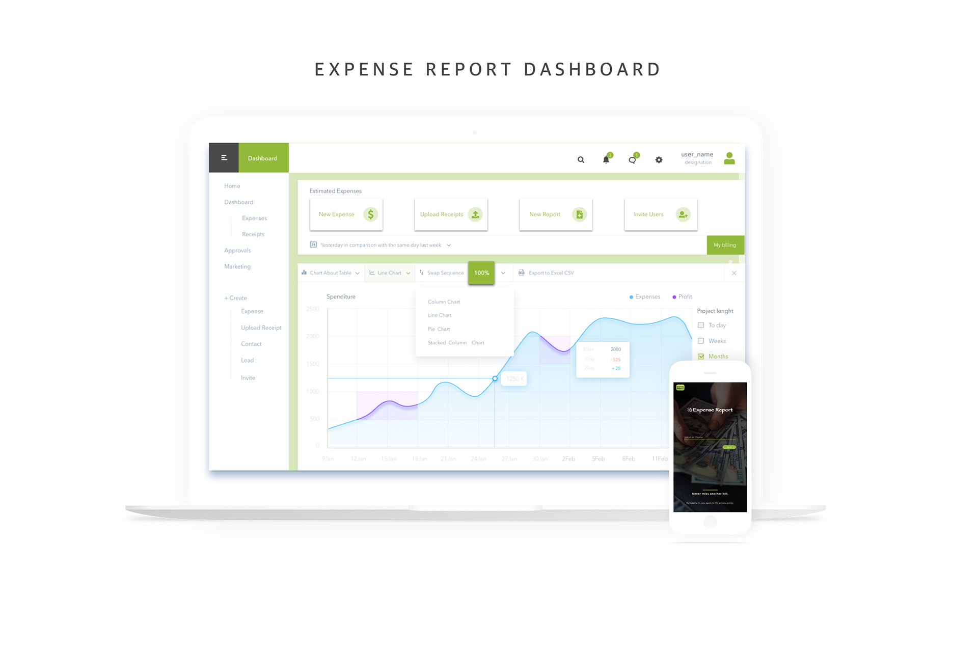
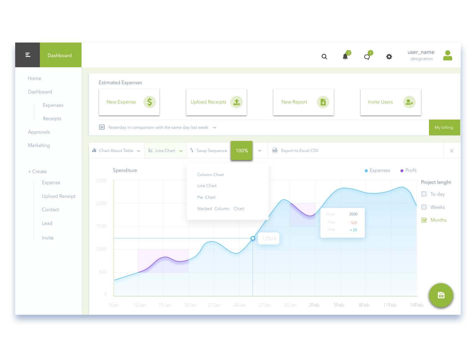
FINAL SOLUTION