Expense Report App icon
Expense Report is looking to improve their customer's experience by creating a way for them to report expenses online.
My Role
I was tasked with researching and ideating the potential functionality of this new feature.
Overview
By the end of the sprint, I had a working clickable prototype that allows users to browse and report their expenses online with their colleagues(team members) or individually.
My UX process
Research Tools: The survey, user interviews
Goals
1. Understand the target user's pain points around reporting expenses online.
2. Understand how the target user categorizes items in the Expense Report app.
3. Learn typical UI elements of reporting expense experience online.
User Interviews
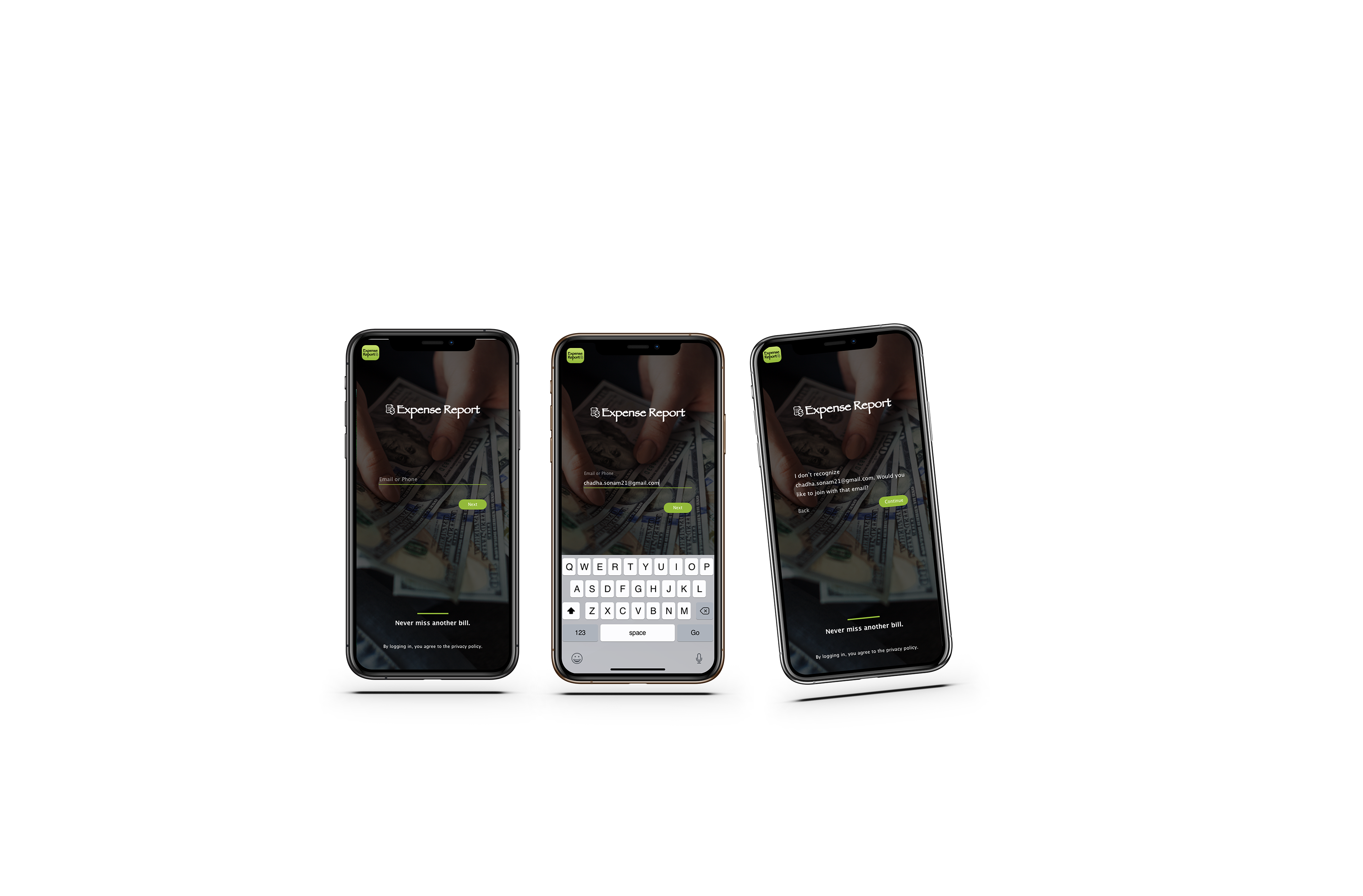
My first challenge was understanding the target user's pain points. I interviewed six people, who worked at corporate companies for more than 10 years and has been reporting expense manually initially and then via web apps. During the 10 minute interview, we discussed difficulties around reporting expenses in person vs online and what their methods are for reporting expenses.
Creating a browsable expense report mobile app.
Tools: Expense report analysis
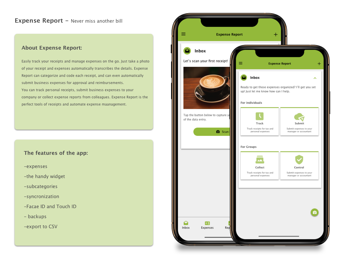
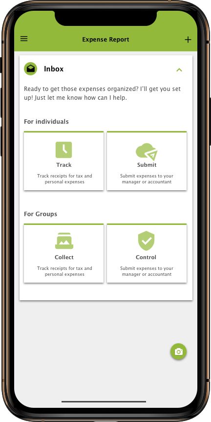
The next challenge was to develop logical information architecture to create a browsing experience that will save time by making expenses easy to report.
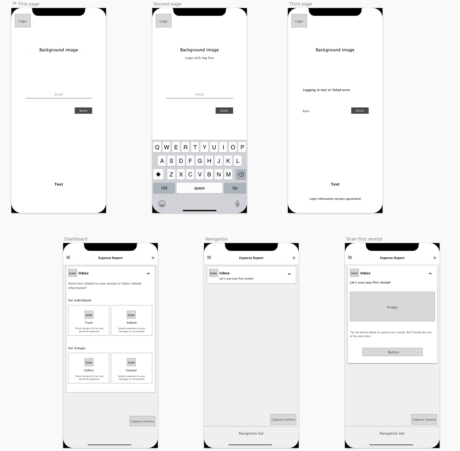
Low fidelity wireframes for Expense report
Designing the complete Expense Report experience.
Tools: User flow, paper prototype
The user flows informed what sketches would be necessary to complete the task of find and reporting an item. I refined the sketches and performed several in-person usability tests to work out major structural issues with the flow.
Major design goals include:
- Simple and easy browsing for quick decision making.
- Provide educational support to mitigate costly mistakes.
- Provide a way to ask for advice from professionals.